

10 Tips for Choosing Decorative Art Tiles

Choosing Decorative Art Tiles is not simply a matter of finding the most colorful pattern. The right tile must suit the room, withstand its conditions, and support the intended atmosphere. A hand-painted coastal design may look beautiful in a showroom, yet appear overwhelming beside dark cabinets. A glossy tile can brighten a narrow kitchen, while its surface may reveal fingerprints and water spots quickly. These small details often shape satisfaction more than the first visual impression.

This guide presents 10 practical tips for making a confident, informed choice. It considers tile material, glaze quality, dimensions, color balance, installation needs, cleaning routines, and supplier reliability. Experienced designers usually request samples before ordering, because screen colors can differ from physical finishes. They also check product specifications, batch consistency, and suitability for walls, backsplashes, or sheltered outdoor areas. Even careful buyers make mistakes. I have learned that a beautiful sample does not guarantee a successful installation. Room lighting, grout color, and nearby textures can change the final result dramatically. Measure twice. Order carefully.

Reliable suppliers should explain manufacturing methods, maintenance requirements, and possible variations in handmade pieces. Those variations are not always defects, but they should never be hidden. By combining visual judgment with practical testing, homeowners and professionals can select tiles that remain attractive over time. The following tips will help you compare options clearly, avoid expensive surprises, and create a finished surface with genuine character.
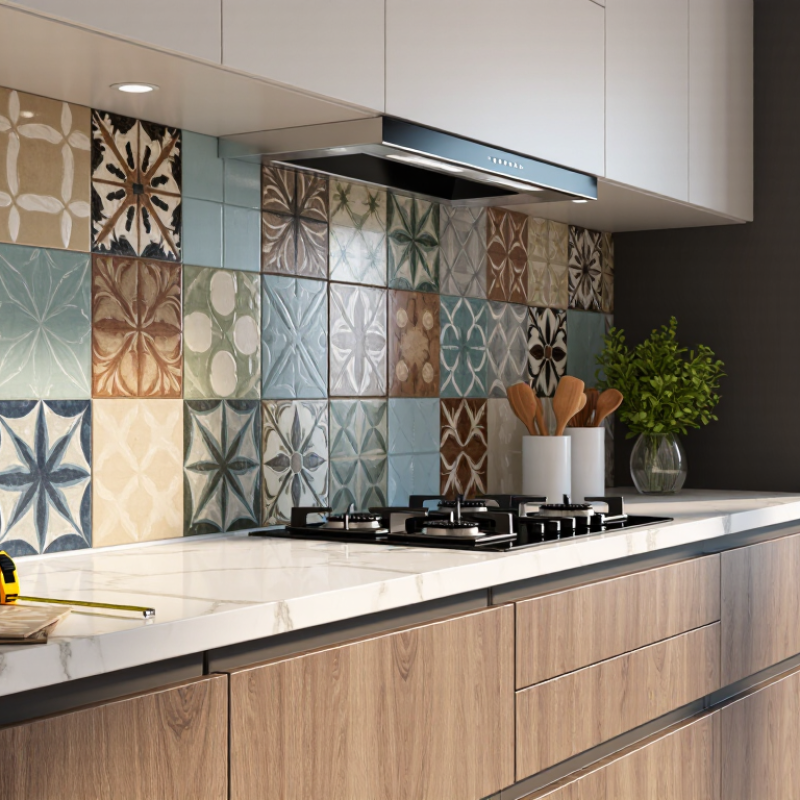
10 Tips for Choosing Decorative Art Tiles

Understanding Decorative Art Tiles and Their Uses

10 Tips for Choosing Decorative Art Tiles

Understanding Decorative Art Tiles and Their Uses

Decorative art tiles bring color, texture, and storytelling to ordinary surfaces. They work well on backsplashes, shower niches, fireplace surrounds, entry walls, and furniture accents. Avoid assuming every artistic tile suits flooring. Some surfaces need stronger wear resistance and slip control. Choose the location before choosing the pattern. Small samples can reveal surprising differences.

Grand View Research estimated the global ceramic tiles market at about USD 227.9 billion in 2023, with projected annual growth of 7.8% through 2030. This growth reflects wider renovation activity, but demand does not replace careful selection. Check water absorption for wet areas. Confirm the tile’s slip rating for floors. Ask about frost resistance outdoors. Inspect three pieces together. Handmade tiles often vary in thickness, shade, and edge shape.

Light changes everything. Test samples beside daylight, warm bulbs, and dark grout. Measure the surface twice, then allow roughly 10% extra for cuts and future repairs. Match grout width to the tile’s shape, not only its size. A busy pattern may need quiet surrounding materials. Keep cleaning practical, especially near cooking areas. Thin decorative pieces may require a compatible adhesive and an experienced installer.

A useful admission: the most beautiful sample can still feel wrong across a large wall. I would live with the sample for several days. The U.S. Joint Center for Housing Studies projected home improvement and maintenance spending near USD 485 billion in 2024, making durable choices increasingly important. A modest mistake can become expensive when removal damages the substrate.

Assessing Space, Style, Size, and Color Requirements

10 Tips for Choosing Decorative Art Tiles

Begin by assessing the room’s function, natural light, and viewing distance. A narrow hallway may need a quiet border, while a dim kitchen can benefit from reflective glazed tiles. Measure the wall twice. One missed outlet can disrupt an entire pattern.

Choose a style that supports existing materials, rather than competing with them. Match warm tiles with oak, brass, or terracotta tones. For cooler interiors, consider blue, gray, or soft green. The 2024 NKBA Design Trends Report surveyed hundreds of kitchen and bath professionals and identified personalization and natural influences as continuing priorities. Use that insight carefully. A trend can date quickly. Select a motif that still feels personal after several years. Limit the strongest pattern to one focal area.

Size affects rhythm and maintenance. Large tiles create fewer grout lines, while small mosaics suit curved edges and detailed borders. Check the tile’s actual dimensions, not only its nominal size. Color also changes under daylight, warm bulbs, and shadows, so test physical samples at different times. The Tile Council of North America recommends evaluating installation conditions, substrate preparation, and grout compatibility before installation. Do not skip this step. I once approved a color from a screen that looked completely different beside limestone. Leave room for revision, and order extra pieces for future repairs.

10 Tips for Choosing Decorative Art Tiles: Assessing Space, Style, Size, and Color Requirements
Tip Assessment Focus Useful Dimensions or Guidance Best Application Practical Selection Check
1 Measure the available surface Calculate the surface area in square feet or square meters. Add approximately 10% extra for cutting, breakage, and future repairs. Kitchen backsplashes, bathroom accent walls, fireplace surrounds, entry niches, and small feature panels. Measure the height and width in several places, then subtract openings such as windows, outlets, and cabinets before ordering.
2 Match the tile scale to the room Common decorative formats range from 4 × 4 in to 12 × 12 in. Smaller rooms usually benefit from patterns that do not overwhelm the available wall area. Use smaller formats for narrow borders and compact walls; use larger formats for broad focal areas with fewer interruptions. Tape a paper template of the proposed tile size to the wall. View it from the room entrance and from normal standing distance.
3 Choose a pattern that suits the architectural style Geometric patterns create structure, botanical motifs add softness, and restrained linework supports minimalist interiors. Coordinate the tile motif with cabinet profiles, hardware shapes, flooring patterns, and existing architectural details. Limit the space to one dominant decorative pattern. Keep surrounding surfaces quieter when the tile has strong movement or contrast.
4 Evaluate color in the actual lighting Natural daylight, warm bulbs, and cool bulbs can noticeably change perceived color. Light-reflective surfaces generally make a space feel brighter. Review samples in kitchens, bathrooms, hallways, and other areas where lighting conditions differ throughout the day. Place a physical sample beside the countertop, paint, flooring, and cabinetry. Observe it in morning, afternoon, and evening light.
5 Coordinate the grout color A matching grout color visually blends joints, while a contrasting grout emphasizes the pattern and installation lines. Use low-contrast grout for intricate artwork and stronger contrast when the tile layout itself is intended to be a design feature. Compare the tile with at least two grout samples. Remember that grout can appear lighter or darker after installation and curing.
6 Confirm the installation environment Select materials according to exposure to water, heat, stains, abrasion, and cleaning products. Wall tiles are not automatically suitable for floors. Use products rated for the intended location, especially around showers, cooktops, floors, outdoor areas, and fireplace surrounds. Review the product's technical sheet for water absorption, slip resistance, temperature limits, and approved installation locations.
7 Plan the layout before purchasing A balanced layout avoids very narrow cuts. Centering the design or aligning it with a focal point often produces a more intentional result. Particularly important for framed murals, repeated motifs, borders, medallions, and backsplash areas with multiple outlets. Draw a scaled elevation showing tile lines, corners, outlets, appliances, trim, and the proposed starting point.
8 Check thickness and transitions Decorative tiles may differ in thickness from surrounding field tile. Even small height differences can affect trim, edges, and cleaning. Use compatible edge profiles or planned transitions where decorative tiles meet painted walls, stone, countertop surfaces, or standard tile. Compare tile thicknesses and confirm that corners, exposed edges, outlets, and adjoining surfaces can be finished neatly.
9 Consider maintenance and texture Deep relief, uneven surfaces, and highly textured finishes collect more dust and grease than smooth, flatter surfaces. Smooth or moderately textured tiles are practical behind cooking areas and sinks; highly sculptural tiles are better suited to low-contact feature walls. Ask how the surface should be cleaned and whether it requires sealing. Avoid abrasive cleaners unless the manufacturer specifically permits them.
10 Order samples from the same production batch Color, shade, texture, and dimensions can vary between production batches. Buying extra material from one batch helps maintain visual consistency. Essential for large installations, continuous patterns, murals, and projects where several cartons will be installed together. Inspect multiple pieces before installation and keep several spare tiles labeled with the room and installation date for future repairs.
Planning note: Always verify product-specific installation instructions, technical ratings, substrate requirements, and local building regulations before installation.

Choosing Suitable Materials, Patterns, and Finishes

10 Tips for Choosing Decorative Art Tiles

Choosing Suitable Materials, Patterns, and Finishes

Decorative art tiles can shape a room’s mood, but beauty should not outrank performance. Material choice sets the foundation. Porcelain handles moisture, temperature changes, and frequent cleaning well. Ceramic offers more design flexibility, but quality varies between products. Natural stone adds depth and subtle variation, though it may need regular sealing. I once selected a beautiful unsealed tile for a busy kitchen wall. Grease marks appeared faster than expected. That mistake changed how I read technical specifications.

A pattern should support the room’s proportions, not compete with every surface. Study full-size samples under daylight and warm indoor lighting. Small samples can hide strong color shifts. For a narrow backsplash, vertical motifs may create useful visual height. Large geometric designs can overwhelm compact walls. Hand-painted patterns often include gentle irregularities. That character can feel authentic. It can also look untidy if the layout is too crowded.

Finish affects touch, reflection, cleaning, and safety. Glossy surfaces brighten dim areas but show splashes and fingerprints quickly. Matte finishes feel calmer and disguise minor marks. In wet areas, confirm the tile’s slip performance and installation suitability. Check current local requirements and follow the installer’s guidance. Ask about sealing needs, grout compatibility, and cleaning methods. Test a spare tile with your intended cleaner. Never assume every finish behaves alike. A slightly imperfect sample often reveals more than a perfect showroom display.

Evaluating Tile Quality, Durability, and Installation Needs

Choosing decorative art tiles requires more than matching colors. In site inspections, I have seen beautiful tiles fail because their surfaces were too porous. Check the technical sheet first. ANSI A137.1 classifies impervious tile as absorbing 0.5% water or less. That matters in kitchens, bathrooms, and outdoor settings. Lower absorption usually supports better stain resistance, but it does not guarantee perfect performance.

Look closely at glaze consistency, edge straightness, and surface pinholes. Hold two tiles together under bright light. Uneven edges can create visible lippage after installation. For floors, review the slip-resistance result, not only the product’s appearance. ANSI A326.3 uses a wet dynamic coefficient of friction benchmark of 0.42 for many level interior walking surfaces. Site conditions still matter. Dust, soap, and poor drainage can reduce safety.

Installation needs deserve equal attention. The Tile Council of North America’s 2024 Handbook emphasizes movement accommodation and suitable substrates for tile assemblies. Ask whether the wall or floor is flat, clean, and structurally stable. Decorative pieces may need careful layout because small pattern errors become obvious. I once accepted a slightly uneven surface to save time; the finished pattern looked restless. That decision was avoidable. Also confirm grout width, adhesive compatibility, and cutting methods before purchase. A sample panel can reveal problems that product photographs hide.

Planning the Budget, Purchase, Placement, and Maintenance

10 Tips for Choosing Decorative Art Tiles

Plan the budget before admiring patterns. Reserve 10–15% for breakage, delivery, trim, and installation adjustments. The 2024 Houzz & Home Study reports that about nine in ten renovating homeowners hire professionals for at least one task. Tile setting deserves that caution. Ask for a written quote covering surface preparation, waterproofing, grout, labor, and waste. Compare samples in daylight. A low-priced tile may need more cutting or special sealing. That is where savings disappear.

Buy two extra pieces from the same production batch. Keep the invoice and installation instructions. Check shade variation, thickness, slip resistance, and water absorption before payment. For kitchens, place art tiles behind the cooktop only when their finish tolerates heat and grease. In bathrooms, confirm compatibility with constant moisture. The Tile Council of North America emphasizes following recognized installation standards, yet homeowners often focus on appearance first. I have made that mistake. A beautiful tile cannot correct a weak substrate.

Map the wall with painter’s tape before installation. Center the focal motif, but avoid placing it where cabinet doors strike. Use a balanced border around outlets and corners. Choose contrasting grout for definition, or matching grout for a quieter surface. Seal porous tile and grout according to the manufacturer’s instructions. Wipe splashes with a soft cloth and pH-neutral cleaner. Avoid abrasive pads and acidic products. Photograph the finished layout for future repairs. Maintenance is not difficult, but neglect becomes visible.

Decorative Art Tile Project Budget Allocation

A practical planning model for decorative tile projects: allocate the largest share to the tiles themselves, while reserving funds for installation, surface preparation, grout or sealant, and unexpected costs. Actual costs vary by tile material, project size, design complexity, and local labor rates.